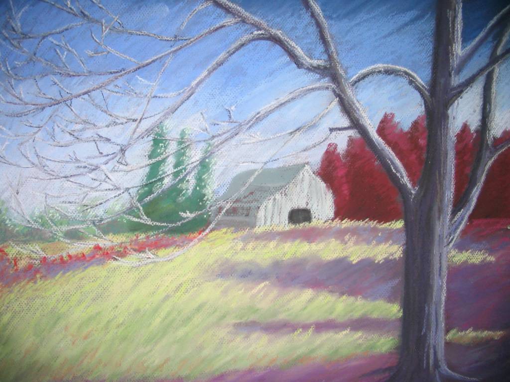
As I have mentioned before, one of the hardest parts of the painting process for me is naming the final piece. This one is still untitled even thought it has been matted and framed (another thing I hate doing is picking out a matte before framing). I had something for this that I thought I liked, but after thinking about it some more, I really did not like it. Mostly, my choice of a titled is fairly generic "Cheetah after the kill" or "Horst Study #1" but I would really like to be able to find a title that embodies the painting. So far, easier said than done.
So, anyone have any suggestions for this? Does it say anything to you? Comments and suggestions would be appreciated.
Friday, October 29, 2004
Tuesday, October 26, 2004
Old Pencil Drawings
As I am waiting to finish my latest pastel painting (yes! two paintings in one month, I must be inspired!) I thought it might be cool to post some older pencil drawings. The first (Her Stare) was done when I was 17 while the second (Koriand'R vs. Komand'R) was done at the ripe ol' age of 12. Sometimes I look back at my older pencils from around that time and I think this was the height of my drawing ability. It is certainly the most prolific period (I have a box full of sketch books that are brimming with all sorts of sketches and drawings). The reason I think that it may have been the height of my drawing ability was because when I was 12-13, there was nothing that I thought I could not draw. I was definitely more fearless. Now, I chose my subject matter with a certain bit of care. Today, my painting skill has certainly improved, but my drawing skill. . .well, it may just be a bit rusty.
.jpg)
.jpg)
Monday, October 04, 2004
.jpg)
Reflections at the Mountain’s Edge
9x12, pastel on paper
Before continuing, the painting was sprayed with Workable Fix to add more tooth to the surface. This final step was completed primarily with Unisons, but some Schminckes were also used. Since I wanted this piece to have some energy, I left the pastel strokes evident in the sky, instead of trying to make the sky look “atmospheric” by blending the colors. After several failed attempts with the lake, I decided that the simplest decision was the best, and it too became a reflection of the sky. Finally, greater detail was added to the mountain slope.
The hardest part for me, aside from starting, is to name the final painting. After trying several very lame alternatives, I settled on “Reflections at the Mountain’s Edge.”

.jpg)
Third Step
9x12, pastel on paper
Using Unisons, I reshaped the outline of the mountains and blocked in the colors for the sky. I also redrew the reflection of the mountains that I noticed was not even close to being a mirror image. The mountains in the far background were given some shadows to draw to make them more distinct. Again, the water was changed, this time to a darker, deeper purple. It was better than the red, but I was still unhappy with the result.
.jpg)
Second Step
9x12, pastel on paper
Here I begin to use my trusty ol’ Rembrandt pastels, blocking in colors. The dark areas begin to be defined and the mountains start to take shape. I chose reds for the water, not sure why, but I was very unhappy with the results. The water would be changed several more times before the finished painting.
.jpg)
First Step
9x12, pastel on paper
I wanted this piece to have some energy, so I chose orange colored paper, the complimentary color of blue, which was the primary color of this piece. Normally, I start with a value drawing in charcoal, but I had recently bought a set of Nupastels. These hard pastels are very good for an underpainting. At this stage, it is a very rough drawing, with only suggestions of where everything is going to be.
Sunday, October 03, 2004
.jpg)
Subscribe to:
Comments (Atom)